
" Historical Chart "

Return to KirkLindstrom.com home page
|
S&P500 Inflation Adjusted
Earnings " Historical Chart " |
|
Return to KirkLindstrom.com home page |
|
|
|
December
9, 2011:
From Chartoftheday.com1 With third-quarter earnings largely in the books (99% of S&P 500 companies have reported for Q3 2011), today's chart provides some long-term perspective on the current earnings environment by focusing on 12-month, as reported S&P 500 earnings. Today's chart illustrates how earnings declined over 92% from its Q3 2007 peak to Q1 2009 low which brought inflation-adjusted earnings to near Great Depression lows. Since its Q1 2009 low, S&P 500 earnings have surged (up over 1100%) and currently come in at a level that is greater than what occurred at the peak of the dot-com bubble and very near what occurred at the peak of the credit bubble. It is interesting to note that the original run up in real earnings from Great Depression lows to credit bubble highs took over 78 years. The current spike has taken 29 months. 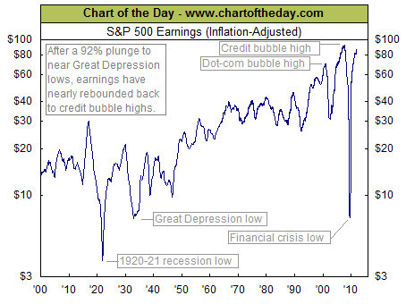
Article:
Beware
of
Annuities
|
|
|
|
Note 1. Source:
Chart of the
Day "Journalists
and bloggers may post the above free Chart of the Day
on their website as long as the chart is unedited and
full credit is given with a live link to Chart of the
Day at http://www.chartoftheday.com."
|
||
 |
||
| KirkLindstrom.com Home of "CORE & Explore®" investing. |
Blog |
|||
FREE=> Investment
Letter
SAMPLE <==
FREE
Disclaimer: The information contained in this seb site is not intended to constitute financial advice, and is not a recommendation or solicitation to buy, sell or hold any security. This blog is strictly informational and educational and is not to be construed as any kind of financial advice, investment advice or legal advice. Copyright © 2010 Kirk Lindstrom. Note: "CORE & Explore®" was coined by and is a registered trademark of Charles Schwab & Co., Inc. |
||||