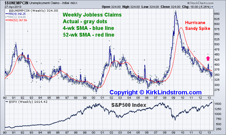
Weekly Jobless Claims vs. S&P500 Price Graph 1990 to Today

Return to KirkLindstrom.com home or Charts page
 |
S&P500 vs Employment Report Weekly Jobless Claims vs. S&P500 Price Graph 1990 to Today |

|
| Historical Jobless Clams vs Prices of the Standard and Poor's 500 Index Return to KirkLindstrom.com home or Charts page |
|
|
| May 6, 2013: PE
ratios usually fall when investors slowly lose interest in
stocks. The exceptions are bear market crashes when
companies lose money and write off everything but the
kitchen sink to often show negative earnings. Weekly Jobless Claims vs S&P500 Index
 May 3 S&P 500 Breaks Above 1600, SPY At Another Record High And ECRI's WLI Moving Higher April 5 These High-Yielding DOW Stocks Should Do Well After Today's Poor Jobs Report |
|
|
|
|
|
Note 1. Source: Stockcharts.com
|
|
 |
|
 |
KirkLindstrom.com Home of "CORE & Explore®" investing. |
Blog |
||
FREE=> Investment
Letter
SAMPLE <==
FREE
Disclaimer: The information contained in this seb site is not intended to constitute financial advice, and is not a recommendation or solicitation to buy, sell or hold any security. This blog is strictly informational and educational and is not to be construed as any kind of financial advice, investment advice or legal advice. Copyright © 2013 Kirk Lindstrom. Note: "CORE & Explore®" was coined by and is a registered trademark of Charles Schwab & Co., Inc. |
||||