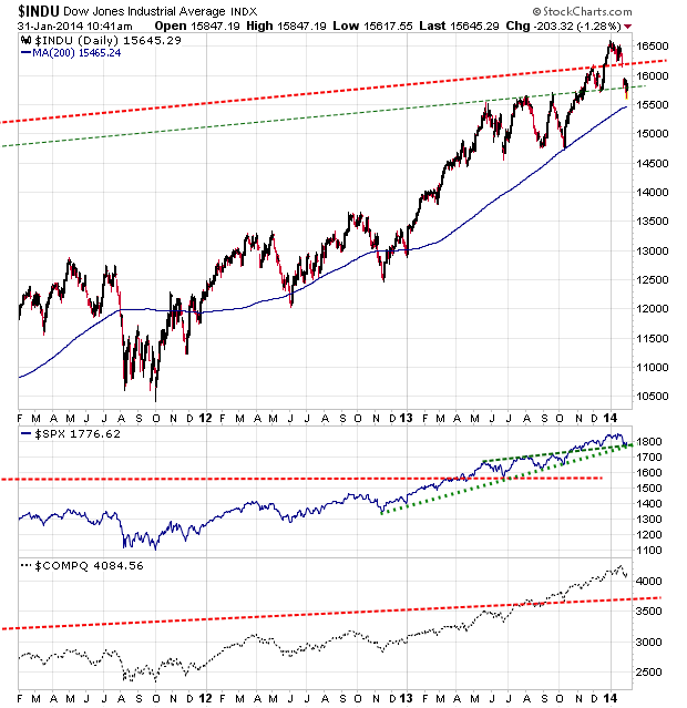
Resistance and Support levels for the DOW - Linear Scale

KirkLindstrom.com: Favorite Charts & Graphs - More Articles - Blog

|
Dow & S&P500 Resistance and Support Levels Resistance and Support levels for the DOW - Linear Scale |
 |
| Charts
and price quotes for DJIA and DIA KirkLindstrom.com: Favorite Charts & Graphs - More Articles - Blog |
|
|
|
January 31, 2014: The exchange traded funds (ETF) for the Dow and S&P500 are DIA and SPY, respectively.
My chart below shows the Dow and S&P500 as indexes and the ETFs with dividends reinvested. The ETF for the NASDAQ is the 100 stock QQQ (for the NASDAQ 100) but I like my Newsletter Explore portfolio far better than the QQQ because the QQQ index adds stocks when up and drops them when low while I do the opposite with my newsletter portfolio. Chart 1
|
| Share this on Google+
|
|||||
Notes: My Observations for the Dow, S&P500 and NASDAQ
 Intraday Charts
|
|
||||
 |
|||||
| TOP of Page |
||

|
KirkLindstrom.com Home of "CORE & Explore®" investing. |
Blog |
| note 1. Source: charts from stockcharts.com Disclaimer: The information contained
in this web site is not intended to constitute
financial advice, and is not a recommendation or
solicitation to buy, sell or hold any security.
This blog is strictly informational and
educational and is not to be construed as any kind
of financial advice, investment advice or legal
advice. Copyright © 2013 Kirk Lindstrom.
Note: "CORE & Explore®" was coined by and
is a registered trademark of Charles Schwab &
Co., Inc.
|
||