 |
S&P500 PE Ratio & CAPE History Historical S&P500 Price to Earnings Ratio with Charts |

|
| Historical Price to Earnings
Ratio of Standard and Poor's 500 Index Subscribe to my newsletter to get regular updates on PE and P/E10 KirkLindstrom.com: Favorite Charts & Graphs - More Articles |
|
|
|
|
March 4, 2015:
Currently, the PE ratio for the S&P500 using GAAP earnings of
$100.23 for the past 12 months is 20.03 according to the February 27, 2015 update at McGraw Hill.
Using "operating earnings" of $112.92 for the past 12 months, the PE
Ratio for the S&P500 is 18.23. Data Summary:
Summary of Data (click to view full size)
 Over the past 114 years, the rage for the price to earnings ratio (PE ratio) of the S&P500 is 5 to 150. Click to see Today's PE vs Time Chart from Chart of the Day. Excerpt and graph from my March 2015 Newsletter:
P/E10, or CAPE
(Cyclically Adjusted Price Earnings) Ratio Subscribe to my newsletter to get regular updates on PE and P/E10 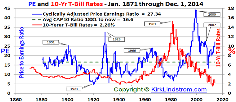 |
|||
|
|
|||
|
The S&P500 came very
close to having zero earnings at the peak of the
financial crisis. When you divide
stock price by nearly zero earnings, you get a
very, very high PE.
From Chartoftheday.com1 Today's chart illustrates the price to earnings ratio (PE ratio) from 1900 to present. Generally speaking, when the PE ratio is high, stocks are considered to be expensive. When the PE ratio is low, stocks are considered to be inexpensive. From 1900 into the mid-1990s, the PE ratio tended to peak in the low to mid-20s (red line) and trough somewhere around seven (green line). The price investors were willing to pay for a dollar of earnings increased during the dot-com boom (late 1990s), surged even higher during the dot-com bust (early 2000s), and spiked to extraordinary levels during the financial crisis (late 2000s). Since the early 2000s, the PE ratio has been trending lower with the very significant but relatively brief exception that was the financial crisis. More recently, the PE ratio has trended higher (to around the 18 to 20 level). However, over the past two years, corporate earnings have increased enough to maintain a relatively flat PE ratio even in the face of rising stock prices -- an overall positive for the stock market. 
Article:
Beware
of
Annuities
|
|
||
|
Note 1. Source:
Chart of the
Day "Journalists and bloggers
may post the above free Chart of the Day on their
website as long as the chart is unedited and full
credit is given with a live link to Chart of the Day
at http://www.chartoftheday.com."
|
|||
 |
|||
| KirkLindstrom.com Home of "CORE & Explore®" investing. |
Blog |
|
| FREE=> Investment
Letter
SAMPLE <==
FREE Disclaimer: The information contained
in this web site is not intended to constitute
financial advice, and is not a recommendation or
solicitation to buy, sell or hold any security.
This blog is strictly informational and
educational and is not to be construed as any kind
of financial advice, investment advice or legal
advice. Copyright © 2014 Kirk Lindstrom.
Note: "CORE & Explore®" was coined by and
is a registered trademark of Charles Schwab &
Co., Inc.
|
||