|
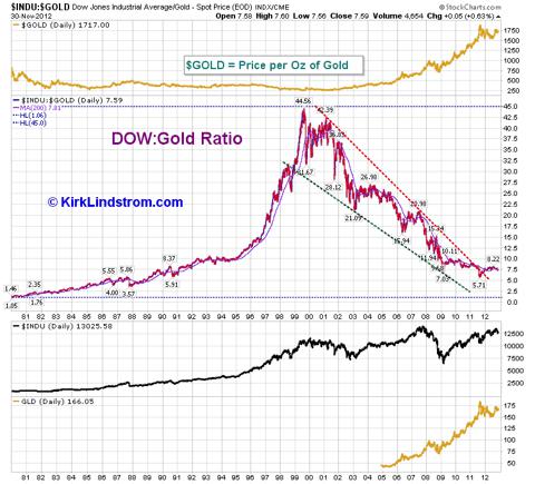
2012 Year Dow Gold Ratio Resistance and Support levels for the DOW to Gold Ratio |
 |
| Return
to
KirkLindstrom.com
home page Quotes and Charts for Gold & GLD (the ETF for Gold) |
|
|
|
December 3, 2012: Today I published an article at Seeking Alpha titled "Dow/Gold
Ratio Remains Low On Historical Basis."
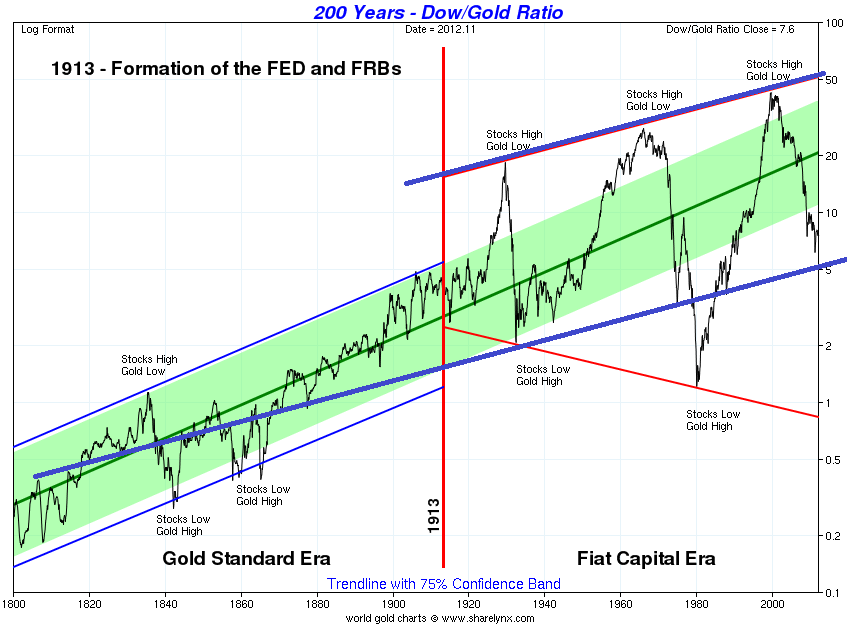
One reader thought the long term chart in my article titled "200 Years - Dow/Gold Ratio" could be improved on so he gave a link to a temporary chart in the comments section. His chart added blue resistance and support lines for the period prior to the Federal Reserve Act of 1913 created the Fed and red resistance and support lines for after the Fed was created. The lower red line on the chart makes the "gold bugs" very bullish case for gold. Of course, there are many ways to connect stars in the sky to see figures, so I added lines that make a bullish case for stocks relative to gold. |
Here is the formula:
The Dow-Gold Ratio is a
measure of inflation and stock market sentiment. It shows how many
ounces of gold it takes to buy the 30-stock Dow Jones Industrial
Average.
Top of Page
Note: It is possible that Federal reserves printing money causes BOTH gold and stocks to go higher.
|
|
 |
|
| KirkLindstrom.com Home of "CORE & Explore®" investing. |
Blog |
||||
FREE=> Investment
Letter
SAMPLE <==
FREE
Disclaimer: The information contained in this web site is not intended to constitute financial advice, and is not a recommendation or solicitation to buy, sell or hold any security. This blog is strictly informational and educational and is not to be construed as any kind of financial advice, investment advice or legal advice. Copyright © 2012 Kirk Lindstrom. Note: "CORE & Explore®" was coined by and is a registered trademark of Charles Schwab & Co., Inc. |
|||||