|
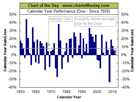
The Average annual gain of the DJIA by Year DOW 30 Performance by year from 1950 through 2012 |

|
| Newsletter Subscribe Return to KirkLindstrom.com home page - Charts |
|
|
|
January 3, 2013: Chartoftheday.com1
wrote:
This table shows the yearly and average annual gain of the DOW (DJIA) by Year.Today's chart provides some perspective on 2012's stock market performance. Today's chart illustrates each calendar year performance (dark blue columns) of the Dow since 1950. These calendar year performances have varied from a maximum of 44% back in 1954 to a minimum of -33.8% in 2008 with the overall average since 1950 (gray horizontal line) coming in at 8.1%. So how does the Dow's performance in 2012 compare? The Dow's performance for 2012 (gray column) is slightly below the 1950 to present average. However, it is worth noting that this year's performance does compare favorably to the 2000 to present calendar year average which comes in at a meager 2.2%. The Average annual gain of the DJIA between 1950 and 2012, without dividends, is 8.1%. |
|
|
|
|
Note 1. Source: Chart of the Day
"Journalists
and bloggers may post the above free Chart of the Day on their website
as long as the chart is unedited and full credit is given with a live
link to Chart of the Day at http://www.chartoftheday.com."
|
|
 |
|
| KirkLindstrom.com Home of "CORE & Explore®" investing. |
Blog |
|
Disclaimer: The information contained
in this web site is not intended to constitute
financial advice, and is not a recommendation or
solicitation to buy, sell or hold any security.
This blog is strictly informational and
educational and is not to be construed as any kind
of financial advice, investment advice or legal
advice. Copyright © 2011 Kirk Lindstrom.
Note: "CORE & Explore®" was coined by and
is a registered trademark of Charles Schwab &
Co., Inc.
|
||